23-31 October 2027

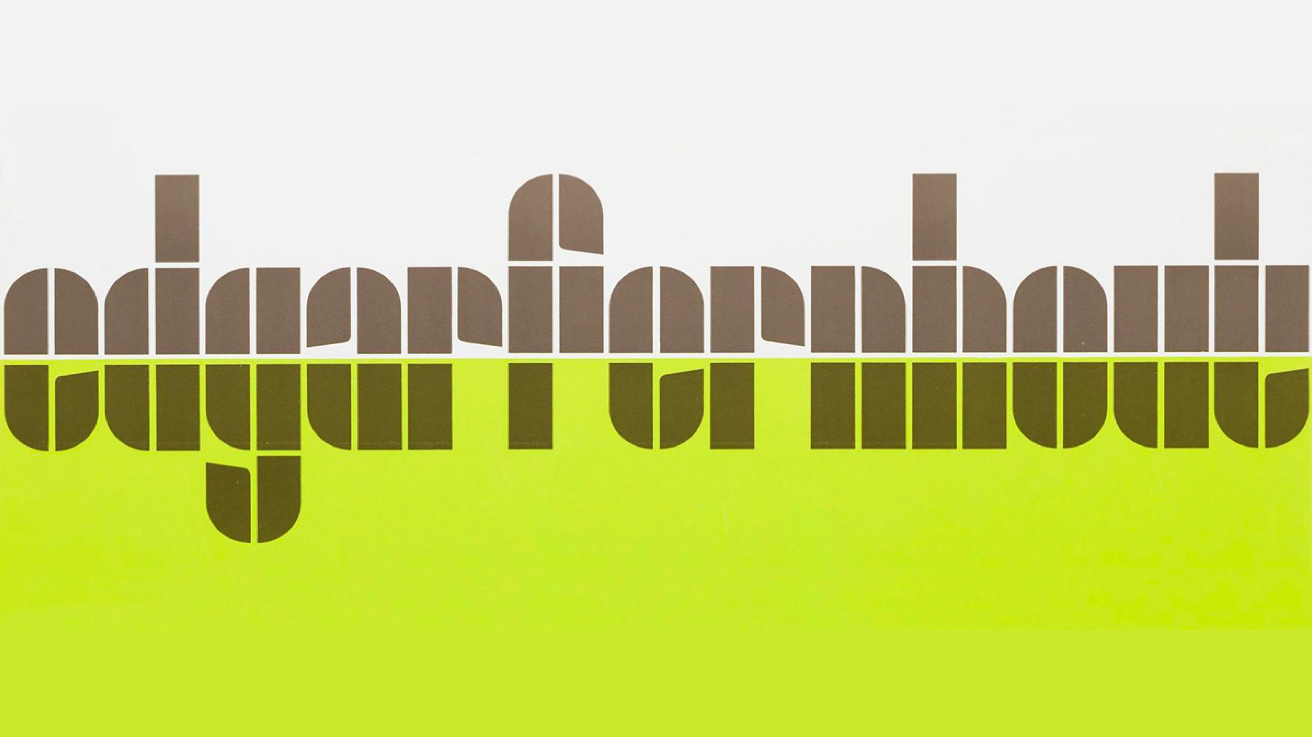
Here, Here! Crouwel & Fernhout.

Hosted by Thonik

This project is now archived and was part of DDW21

Event type

Exhibition

This year Dutch Design Week has a new identity. Thonik gave the almost 20-year-old tulip logo a new lease on life by styling it as the W in the event name.

DDW’s tulip

DDW’s tulip is a constellation of rectangles and quarter circles. These elements were also used in typographic experiments from the 1920s that were revised in 1963 by the late Wim Crouwel. For the Van Abbemuseum retrospective of Dutch painter Edgar Fernhout, Crouwel developed a rather sophisticated take on the typeface by subtly adding indentations to the E, A, R and T. This added rhythm to the logotype and gave it character beyond strict geometry. Having been designed for a museum in DDW’s native Eindhoven – Thonik thought Crouwel’s Fernhout typeface would make a fitting candidate for the new house style.

Hosted by

Thonik
Download press kit

About Thonik

Thonik is the Amsterdam based collective of designers, led by designers Nikki Gonnissen and Thomas Widdershoven. thonik offers their clients a visual voice that sets apart and differentiates: providing pole position.