But which data do these internet giants use and combine? How do they collect these data? And how do the algorithms work that influence our lives? Because, based on these data, we are then fed into the timeline of our social media and are bombarded with adverts that an algorithm has decided we like. Resulting in the ultimate mindfuck: at the end of the day we become the person that giant data collectors as Facebook, YouTube and, of course, data-devourer Google want us to be.

This large existential question is, in fact, being researched on a small scale by the designer. From big data to small data interventions. Designer Julia Janssen, for instance, has thought of a whimsical way to confront us with this. No, this is not about your banking data or your latest Amazon purchase. Data knows us better than we know ourselves; at least that's what she's telling us with Why I Like Green. Janssen observed an ever increasing flow of messages on museums and sportswear popping up on her Facebook timeline. Even more surprising were the articles dealing with Japan and the American Mathematical Society. But the colour green? Is green really my favourite colour, Janssen wondered? And if so, how does Facebook know this?
Four thousand ping pong balls are engraved - mercifully, with a computer-controlled laser - in the various ways her personal data are collected, from cookies to clicking on or clicking away of websites or adverts. By taking a ball each time - as in bingo - you are challenged to think about the question: How do these data determine that Julia Janssen likes the colour green?
Providing insight in a presentable way into the impact of data, is also the idea behind the Data West project. Eight designers have themselves collected data on the residents of the Woensel-West district of Eindhoven. Whereas one designer uses official statistics as a starting point for his analysis of the neighbourhood, others go from door to door to meet the person behind the data. These 'analogue' data are then presented in various ways: with live performances, a 3D setup, interactive animations, drawn illustrations, a radio show or tapestries. A layered project where the outcome is not data driven design but design driven data. Which, in turn, raises all kinds of interesting questions. Which data are the most accurate? And how does the presentation format influence the interpretation of data? But above all: what is the actual difference between data that are analysed by humans or by algorithms?
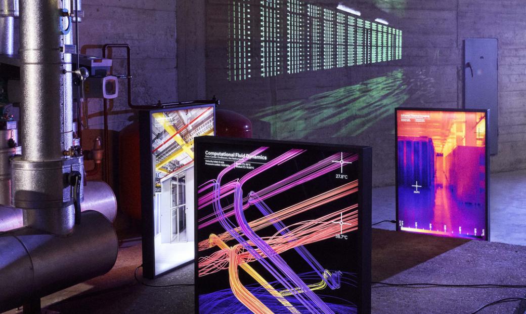
Data, admittedly intangible, are becoming more and more visible in the built environment. The continuous flow of one-click buying, chat interactions and Tinder swipes has led to immense but anonymous data centres popping up all over the landscape. These warehouses with endless rows of servers generate enormous amounts of heat. With Bathing in the cloud, Lucas de Ruiter aims to unravel the invisible world of the data centre. For this graduation project at Design Academy Eindhoven, he applied various photographic techniques, including documentary photography and abstract animations of dataflows. However, de Ruiter also seeks to demystify the physical architecture of data centres. These are often anonymous boxes, hardly ever identifiable, let alone showing what happens inside them. That's why he wants to transform the building itself into a meeting place where you can go off-the-grid. On the roof - in the cloud, so to speak - one should build a wellness centre. The saunas and steam baths use heat that is generated by the servers. One could also play with an imagery of the dataflow with lights. Or even more analogue: the busier the servers, the hotter the sauna. A more physical experience of data is well-nigh impossible.
Written by Jeroen Junte, editor-in-chief DesignDigger.